Many names of music magazine are simply one or a few letters, like Q or NME. However, I think I will have a word as the name for my music magazine. This word could be something to do with music as a whole, like 'Note' or 'Pianissimo', or it could be a name that is used when describing an instrument like a guitar, like 'Pick' or 'Strap'. I could also use something like 'E minor' or 'A major' which would be a good path to go down I feel.
I have conjured a new idea and have decided to call my magazine 'Scales and Arpeggios', which are two musical words about musical theory.
Wednesday, 29 October 2014
Thursday, 23 October 2014
Drafting and Planning: Self Assessment
My codes and conventions task was critically analysed by another member of my class. I found that they have a higher opinion of my work than I do which is a plus. My peer told me that she enjoyed my cover lines and found them funny which was my intention so that is great, but I need to add more structure to my work, as at the moment it looks like I have 'just dropped the cover lines and let them float around'. I also need to improve my fonts, as I could use bigger bolder fonts. I feel I concentrated too much on the content of the cover lines, and didn't think about the actual font and size of font. I also need to make sure the date and price is visible, which may mean changing the colour or increasing its size. It was also suggested that I should use paint.net rather than publisher to complete my magazines. I'm not sure whether I will do this however, as I prefer publisher and find it easier to do. I found my feedback helpful, as it helped me understand my strengths and weaknesses.
Monday, 20 October 2014
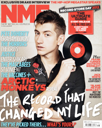
Organisation: Photos
I feel that the time where I need to start thinking about when and where I am going to start talking photos. I am yet to decide on the members of my britpop band, as I'm not sure whether to use the members of my actual band, or other friends. I think I will begin talking photos and thinking about suitable places to take them soon. I like the thought of having some photos inside and some photos outside. I like the idea of direct address in one photo, on the double page spread.
Drafting and Planning: Codes and Conventions Task


Sunday, 19 October 2014
Research Into Similar Products- Double Page spread
 |
| I think this double page spread is brilliant. The headline is a line of one of Bugg's songs which is a really clever pun. The colour scheme, well lack of colour, is an effective colour scheme, as the black and white creates an old fashioned like theme, which links to the artist as he is a 60's style singer songwriter. The black and white image adds an air of mystery about Jake Bugg, and the angle is a low angled shot, making him look important and formidable. The red really stands out on the page. I really like this magazine double page spread, with those colours being a real high point |
Thursday, 16 October 2014
Response to Blog Feedback
 |
| I feel that my I did well on my similar products, as I have done 13. I think this is a good number. However, I have only done 1 for target audience, so it needs improvement. Also, I haven't done any for organisation so will need to start thinking about how I am going to organize. For drafting I have done 5, which I feel satisfactory. Overall, I feel that my work is okay. |
Wednesday, 15 October 2014
Research into Similar Products: Shot Types
 |
| This image is of John Lennon. The shot type used is a close up. This shot helps us really see the hugely recognisable face of Lennon, and helps emphasis facial expressions and facial features. |
 |
| This image is of Alex Turner. The shot type used is a medium shot. This shot allows the reader to see the subject from their hips upwards, so props can be used in their hands and we can see their dress sense, helping create a larger idea on the cover star and their personality. |
Sunday, 12 October 2014
Research into Similar Products: Band Names
The great bands always have completely random names, like The Beatles and The Jam. Many britpop bands also use names that are completely off the hook, but have a meaning behind it, as the Stone Roses where called The Stone Roses because of the huge contrast between the words Stone and Roses. I may do something similar with the name of my band. The name of my actual band in which I am the bassist for is Static Irony, which is a completely random name. I could possibly use this name. Bands like Sleeper and Oasis just have one word as their band name, which is effective as it is easy to remember. I feel like I could call the band absolutely anything, just looking around I could call it 'Window Sill' or 'Printer' or 'Felt Tip'. The variety of choice is extreme, as when on the front of an album cover or magazine, a band can be called just about anything. I like the idea of having an oxymoron as the name of my band, and I could use a Shakespeare oxymoron, such as 'Loving Hate' or 'Cold Fire'. Thanks Shakespeare.
Wednesday, 8 October 2014
Research into Similar Products: Fonts
I think I will use a simple font, because if I use font that looks really cool or impressive is used, it will take away from the actual content of the magazine and everyone will look at the font.
Research into Similar Products: Britpop
Britpop is a subgenre of alternative rock that originated in the United Kingdom. The genre was at it's best in the 90's with bands like Oasis and Blur topping the charts. Britpop bands were influenced by bands from the 60's, 70's and 80's, such as The Smiths and The Beatles. Britpop focused on bands, singing in regional British accents and making references to British places and culture, particularly working class culture. The movement developed as a reaction against various musical and cultural trends in the late 1980s and early 1990s, particularly the grunge phenomenon from the United States.
In the wake of the musical invasion into the United Kingdom of American grunge bands, new British groups such as Suede and Blur launched the movement by positioning themselves as opposing musical forces, referencing British guitar music of the past and writing about uniquely British topics and concerns. These bands were soon joined by others including Oasis, The Verve, Pulp, Placebo, Supergrass, Cast, Space, Sleeper and Elastica.
I think that the band I use for my magazine will be a britpop. It is my favourite genre and I just think people like Ian Brown and Liam Gallagher are unbelievably cool.
I have decided to use the genre of Britpop predominantly in my magazine as I feel it is severely underused in the music market and it should get more of a following in modern day.
I have decided to use the genre of Britpop predominantly in my magazine as I feel it is severely underused in the music market and it should get more of a following in modern day.
Research into similar products- NME Britpop Magazine

I like this magazine front cover because it has 3 separate bands on it with just the lead singer on there. I also adore the background with the British flag, as these three bands are three of the most established britpop bands ever. The fonts are simple and have an effect on the audience that sustains their interest. It is such a colourful, in your face cover. Around the sides there is a banner with other britpop bands on which will further intrigue the potential buyer. The pictures of the three front men are close ups. The three men are recognizable and stand out at soon as you see it. Oasis are the biggest of the 3 bands probably, which is why he is at the front.It is clear to the buyer what this magazine is about, as the magazine masthead is no longer in the left third, it is at the top and the word Britpop has taken over as the most important phrase, interesting fans of the genre.
Thursday, 2 October 2014
Drafting and Planning: Investigating Typography
 |
| Here is a cover of a magazine with six different font ideas on. I had to decide which was my favourite and which was my least favourite. I decided that the worst font was D, because it just doesn't look right. The writing is unclear and old fashioned, and it doesn't suit the theme of the magazine with Christina Aguilera as the cover star. Next, I ranked C in fifth. comic sans is used here, and the magazine just looks childish and slightly intimidating. A was next in line, as , although it is a long way ahead of C and D, it is still fairly bland and doesn't really stand out. I put E in third. The thick capital letters catch the eye, but aren't as effective as F or A. In second place is F. It is a clear font and stands out and doesn't take anything away from the picture, but doesn't have the same effect as B. B uses bold, big letters, with the first letter of each word bolder than the rest. It doesn't distract from the picture, but grabs the attention of the viewer more than any of the others. It is clear, and the font looks mechanical, which links to the main image. This will help me with my magazine because I has helped me decide what kind of fonts I should use, as if I were to choose a font such as D, it would change to way my magazine is presented. |
Wednesday, 1 October 2014

Subscribe to:
Posts (Atom)