Wednesday, 15 April 2015
Media Evaluation
Here is the link for 'other front covers' - http://bentibbitsmedia.blogspot.co.uk/2014/09/analysis-of-magazine-front-covers.html#comment-form
Here is the link for 'task' - http://bentibbitsmedia.blogspot.co.uk/2014/10/codes-and-conventions-task.html#comment-form
Monday, 9 February 2015
Drafting and Planning: Final Draft Front Cover
 |
| Here is my final draft of my front cover. After much thought, I decided to cut the top part of the image where there was a building. This has made the image better. I have also added another cover line to improve the blankness. I am fond of this front cover. |
Saturday, 7 February 2015
Drafting and Planning: Final Draft Contents Page
 |
| I have improved my contents page. I have added much more text, making it more acceptable as a weekly magazine with 67 pages. I have made the font much smaller, which was in order to fit the extra pages. I have added a tagline of 'This week in S&A'. I have made the page numbers more logical and they now work well. I have also changed the background into the same grey as the double page spread, which creates a consistent colour scheme. |
Wednesday, 4 February 2015
Drafting and Planning: Improvements for Contents Page
To improve my contents page I feel that I need to add more articles and pages to my magazine. I also need to make sure the page numbers are logical and make sense in reference to the rest of the magazine. I may also change the background colour as white is bland. I may make it the same colour as my improved double page spread, which is grey. I may also change the subscribe as it does not look particularly realistic.
Monday, 2 February 2015
Drafting and Planning: Final Draft Double Page Spread
 |
| Here is my improved double page spread. My inspiration came from this article about Graham Coxon. I have moved my pull quote and made it much bigger. I have changed the background colour to a light grey, as the blue was random and didn't match the colour scheme. I plan to change the contents to a grey background also. The colour of the font is green. |
Thursday, 29 January 2015
Drafting and Planning: Double Page Spread Possible Improvement
 |
| I have changed some of my double page spread round. I thought that having the image on one side and the text on the other may be too simple so tried to cover the image over both pages. However, the text is placed randomly and the pull quote is randomly placed. It could work, if I improved it vastly. |
Wednesday, 28 January 2015
Drafting and Planning: Double Page Spread Improvements
 |
| To improve the double page spread I intend to possibly only have one pull quote. I may also use a lighter shade of blue and get rid of a question or two. I will move the quotes onto the other side, along will the text, and compress it more. I will also exclude the white on the text and just make it all black, as I feel it looks slightly silly. I will change the page numbers to the correct ones and make the best use of all the positives of my double page spread. |
Wednesday, 21 January 2015
Drafting and Planning: Main Image
 |
| I am trying to decide whether or not to change the top off my image, by getting rid of the conservatory just above the hedge. This may make the image more effective, but it might make the image look unrealistic. I am leaning more towards getting rid of the top part. I am going to try and see how effective it is. |
Monday, 19 January 2015

Thursday, 15 January 2015
Drafting and Planning: Feedback to First Draft
My magazine was assessed by another student in my class. They gave me feedback on what went well on my magazine and what is needed to improve.
The things that went well include that my colour scheme is consistent. I have also included a range of fonts and images. My magazine contains symbiosis and the positioning of stories and images is apparently effective. There is a good use of settings and props, and the band actually look like a band.
To improve, I could include more cover lines. I could make the text of the band name bigger. I could put numbers on my secondary image on the contents page to link with the actual page number. Additionally, I could make fonts over images bigger and bolder.
Wednesday, 14 January 2015

Monday, 12 January 2015
Drafting and Planning: Draft Front Cover and Contents Page
 |
| Here is the the final draft of my Front Cover and Contents page. To complete this I used the program page plus. My colour scheme isn't particularly extensive, as I have mainly used black and white, except for the pug I used on my front cover. I used red here because I wanted it to really stand out. I think the colour scheme is effective as it allows the reader to clearly see all the text clearly, but doesn't take away from the image. I feel the front cover is very effective and looks good. My contents page however seems a bit bland and could be improved. |
Saturday, 10 January 2015
Organisation: Image for Double Page Spread
 |
| Here is my double page spread image. The shot used is a wide shot, allowing the four members to fit into the image nicely. The use of direct address, and serious expressions, gives the band another dimension. They are not only the fun band shown on the front page image, but also a band who mean business. |
Friday, 9 January 2015
Organisation: Photos for Front Cover and Contents Page
 |
| This is the image that I plan to use for my contents page. All 4 members of the band are kneeling down and looking at the camera, using direct address. A fairly high shot is used, looking down on the band, making them look smaller and even possibly innocent. They are also barefoot, which is because it symbolizes the bareness and stripped down nature of Loving Hate. |
 |
| This image is the image I plan to use for my front cover. This image is a long shot, in order to fit all four members in fully from head to toe. The space at the top will allow me to have my masthead and other additions at the top. All the members are looking into the distance and laughing, like something is funny, increasing their likability, as they look fun. |
Thursday, 8 January 2015
Organisation/Drafting and Planning: Change of Photos
I have decided that my original images are not good enough. Unfortunately, I couldn't arrange a band photoshoot before the deadline of the work so I have taken some pictures of myself and my three brothers. However, I will still say that these are the members of Static Irony, as I have already completed an article and other things about the band.
Here are the photos I have taken!


Here are the photos I have taken!
Monday, 5 January 2015
Drafting and Planning: Mastheads
 |
| I have created some mastheads for my magazine. I think the top one has a cool font that may suit the Britpop genre more than the other three. However, the second and bottom fonts are simple and easy to read which may appeal to the reader. I tried to use the full name but it doesn't look as good. I may use the top one then have scales and arpeggios written beneath. |
Friday, 2 January 2015
Drafting and Planning: Images for Double Page Spread
 |
| I will use this image for my double page spread. Although it is not the best quality image, I feel it effectively shows the band in action. |
Drafting and Planning: Contents Page Images
 |
| This is a photo from an older Loving Hate gig that I will use. |
 |
| Here is an image of the band Cubstone. I think I will use this photo when discussing a review on my contents page. |
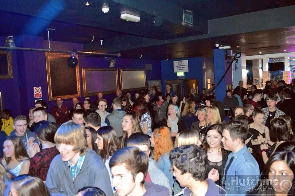 |
| Here is an image I will use on the contents page. It is from a Loving Hate gig. I feel it can be used to show a crowd enjoying the music, indicating that Loving Hate are a talented band. |
Subscribe to:
Posts (Atom)